Organ Trail: Director’s Cut—Embracing Mobile for the Win
 August 16, 2012
  Games, Interface Design, Rant
  esdin
esdin  one response
 Tagged with: Controls • Games • Rant
Late last week, The Men Who Wear Many Hats released the iOS and Android versions of their retro-styled Organ Trail. If the name didn’t give it away, what you’ve got here is essentially a gorgeous little 8-bit styled zombie survival game with heavy roots in the classic Oregon Trail. Your wagon now has the word ‘Station’ in front of it, and you’re fording hordes instead of rivers, but many similarities abound, resulting in a hilariously nostalgic experience that demands solid resource management, luck, and a steady finger. That said, there are plenty of other places you can go to if you’re looking for a review.
Recently I was talking with one of the teachers at my Alma Mater in Full Sail about his new syllabus for an Intro to the Game Industry course, and when he asked for things we thought would be a must-have for the course I fell hard upon the idea of embracing limitations. Limitations in the game industry can come in many forms—there are always budgetary concerns, practical limitations of what the team can realistically accomplish, and of course, there’s never enough time. Beyond that, there are platform specific limitations to be aware of. Outside of the standard Processor/Memory/GPU specs for any given device, a game works best on a platform when it plays to the strengths and control styles best for that platform. Developers building games for touchscreen devices run the gamut on their success or failure with the control style they use and the way they display information to the player.
Different platform inputs vary drastically in today’s gaming world. Modern console controllers have collections of joysticks, d-pads, face, shoulder, and trigger buttons, resulting in a very large number of discrete actions. Computers are of course blessed with the mighty keyboard and mouse, and accessories tuned for every genre. Motion gaming is a feature of every major console, in some cases more successful than others. Smartphones have the benefit of a highly sensitive touch screen and accelerometers.
Problems arise when we try to shoehorn games that work well with one input onto a platform that doesn’t support it. The iPhone market is a particularly good example of this, with lots of
titles that try to jam virtual buttons and joysticks onto the screen. As an example, Vlambeer’s truly awesome Super Crate Box is a great title that has taken some flack for its use of a virtual Left, Right, A, and B setup. Putting these types of controls on the screen forces the player to obscure part of their playing area, and the lack of tactile feedback can send you running the wrong way or firing when you meant to jump. While Super Crate Box managed to pull it off relatively well, leagues of iPhone based versions of popular console genres exist with absolutely unplayable controls. A good deal of derision exists for the ‘fixed’ virtual joystick—without the physical sensors of a real stick, taking your thumb off the screen and placing it back down again almost never results in desired behavior. Characters swing around wildly, a crucial shot is missed, and the player gets frustrated quickly. The idea of an automatically repositioning joystick has since gained a lot of traction, but the player still has their thumb covering the bottom corner of the screen, and it’s hardly the best solution.
On the other side, many games have done a beautiful job of creating an experience that meshes perfectly with touch and tilt inputs. ‘One Button Games’, such as Canabalt, remove the need for any one region to be tied to input—with the whole screen acting as a single glorious input, the play feels natural. EPIC’s Infinity Blade is another excellent example, and the swipes needed to choreograph dodges and attacks wouldn’t be possible on any other platform, barring perhaps a motion game port.
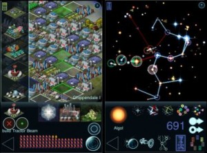
Another problem with limited inputs is data access. Take, for example, something like Civilization. On a PC, with all of the hotkeys you could ever ask for, hiding information two or three panels deep isn’t an issue. Earlier last year, the classic 4X PC game Ascendancy was ported over to iOS. It’s playable, but it’s certainly not a picnic to navigate its deep menus using the touch interface, and there’s no way to see what’s going on in your empire “at a glance”. Want to see how a build order is progressing in any given system? You can navigate through a list of your colony worlds to find the selected planet, or manually click through to the star system. Once there, you can go into the build submenus, and see your progress, plus any other projects you can change to. On a PC this might take a few seconds, using keyboard shortcuts to bring up the appropriate window, but on the iPad, you need to tap your way there. For a turn based game, this is still playable, but imagine trying to create a deep micromanaged RTS on the iPad and you can see how prohibitive it becomes.
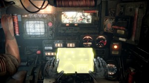
So, now that I’ve covered everything you already know, I’d like to look at the changes made to Organ Trail: Director’s Cut, and highlight the great choices the development team made for mobile devices. The original Organ Trail plays like a classic Apple II game. Your inputs are generally limited to using the number keys for selection, and the space bar for confirmation. On the main ‘travel’ screen, some key information is displayed, such as the general ‘health’ of your party, the amount of fuel and food you have left, and travel information such as how far you have to go to your next pitstop. During combat, the WASD keys are opened up for movement, and the player is locked to the classic 8-directional movement and aiming pattern. Pressing enter while travelling brings up a big list of things such as checking your inventory, stopping to rest, trading, and scavenging for food. While it’s a bit of a crowded display, it’s doable because you have access to a keyboard.
Let’s imagine a world wherein The Men Who Wear Many Hats are not awesome, design minded folks. Fans of the original game keep asking for a port to mobile, and they’re all to happy to oblige, but they go the route of so many other developers and try to keep the game as true to form as possible. While travelling, you can still see the same information as before, but on going into the deeper menu we now have a screen covered in touch hungry buttons. When we go into combat, we have a little joypad on the left side of the screen, and a button to fire on the right. Effectively, two huge portions of the screen are covered with your fingers, and zombies spawning from those corners are hidden for a pretty large portion of their existence. It would work, but it would be decidedly less functional.
Skip back to reality, and we’ll take a look at what they changed and why it’s perfect for iPhone. Our main screen now has a few filters on it—we can see the health of our party and our vehicle by default, so it’s easy to tell when someone needs a rest. If your party’s doing fine, you can toggle over to stats without having to go to an intermediate screen, and see your fuel, food, and distance while your car trundles forward. The time of day, which ties into zombies, has been given a great visual cue, with a moon and sun circling in the background, so you can get a good idea of when it’s worth it to keep driving, and when you should probably bolster your party against a stray attack.
Hitting the stop button takes you into a nicely organized set of screens, each with a handful of large, easy to use options. Killing a party member (hopefully bitten), using a medpack, or resting has been put on a party specific section, while scavenging for food and trading is on a panel that shows you all of your supplies. Jumping into scavenging, or taking a job at one of the many pitstops, brings you into a fully touch controlled scene. Instead of a jammed in joypad and button, tapping on the screen moves your character, and the nifty firing method lets you aim by dragging back from your character, giving you precise control of your shots, and making you feel extra giddy when you snipe a Z from across the screen. The range limitation from the original title has also been removed, which feels much more natural on the tiny iPhone screen, and rewards good marksmanship. In various encounters, this same drag mechanic lets the player shoot at bandits and oncoming solo foes, and is a nice little touch that adds quite a bit more than a tiny text popup or simple tap of the spacebar. Several of the new encounters would have been impossible to create with a standard 8-input pad, and taking advantage of the screen’s touch recognition makes these moments shine.
So, using this as a simple case study, I can’t help but be completely confused when other developers try to jam lots of buttons, submenus, and sticks onto the iPhone. Here we have a small independent team with enough design sense to cater to mobile devices’ strengths, and yet the mistakes of early mobile development still plague the market. To be frank, there are a LOT of things you can do at any given time in Organ Trail, from checking your supplies, healing your party, to choosing to scavenge or trade. With a bit of clever design, none of this feels awkward, and all of it feels natural on the touchscreen. Whether or not it’s the best possible design isn’t important; the fact is that it is a far better design than it could have been, and far too many developers forget to think about this stuff when porting their titles to mobile.
When people wonder why there are so few great Kinect games, or why shooters in iOS games need such a boost in the aim-assist department, it all comes back to these kinds of concerns. You can’t take a game that requires two control sticks and around forty buttons and expect to create a playable experience on the Kinect. In the same way, if you take one of the best SNES titles of all time, and shove it on to the iPhone without thinking about how marring the screen with a massive joystick will affect the experience, you shouldn’t be surprised when the occasional reviewer or player turns away in disgust.
Embracing your limitations, and designing for them, is the best thing you can do for your game. If you really love it, give it the extra thought before putting it somewhere it doesn’t belong.


One thought you don’t address, is how the experience of an iOS game differs from a console or computer title because of the different control schemes. Referencing Infinity Blade again, you praise its innovative use of swipe, on screen triggers, and general utilization of the touchscreen. But the game is linear and cinematic: there isn’t a true sense of control over the character and exploration and NPC interaction is limited to scripted events because the player isn’t given a way to control movement nor make unique story decisions. Does this destroy the empathetic connection where the player becomes the avatar? Is immersion any less because every decision is pre-ordained without even the carefully crafted illusion of choice that say, a Final Fantasy title cultivates?
Extrapolating from there, does this begin to define the medium essentially, as a set of very well polished, interactive films? The interaction between Infinity Blade and the player constitutes scenes where a battle is either won or lost, points gained or a slight bump in the gold treadmill is hit, without a larger or smaller branching of choice or personality to bond the player with the character aside from their shared victories or loses. Does this base formula constitute the very least set of variables where that fourth wall is broken and the player becomes the shining knight?